Overview
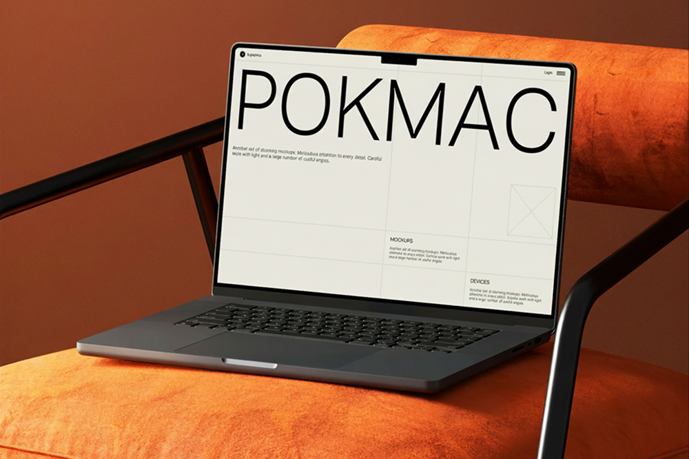
Pokmac needed a modern website to better present their company and services.
The goal was to create a clean and professional experience that reflects their position and makes information easy to access.
Challenge
The previous website lacked structure and consistency.
Content was difficult to navigate, and the overall design did not reflect the company’s scale.
Main issues:
- Unclear content hierarchy
- Outdated visual design
- Low readability across pages
Approach
We focused on clarity and structure.
Key decisions:
- Reorganize content into clear sections
- Simplify navigation for better usability
- Create a consistent visual system across all pages
Design
The design direction is minimal and corporate-focused.
- Clean typography for readability
- Structured grid layout
- Neutral color palette
- Consistent spacing system
Result
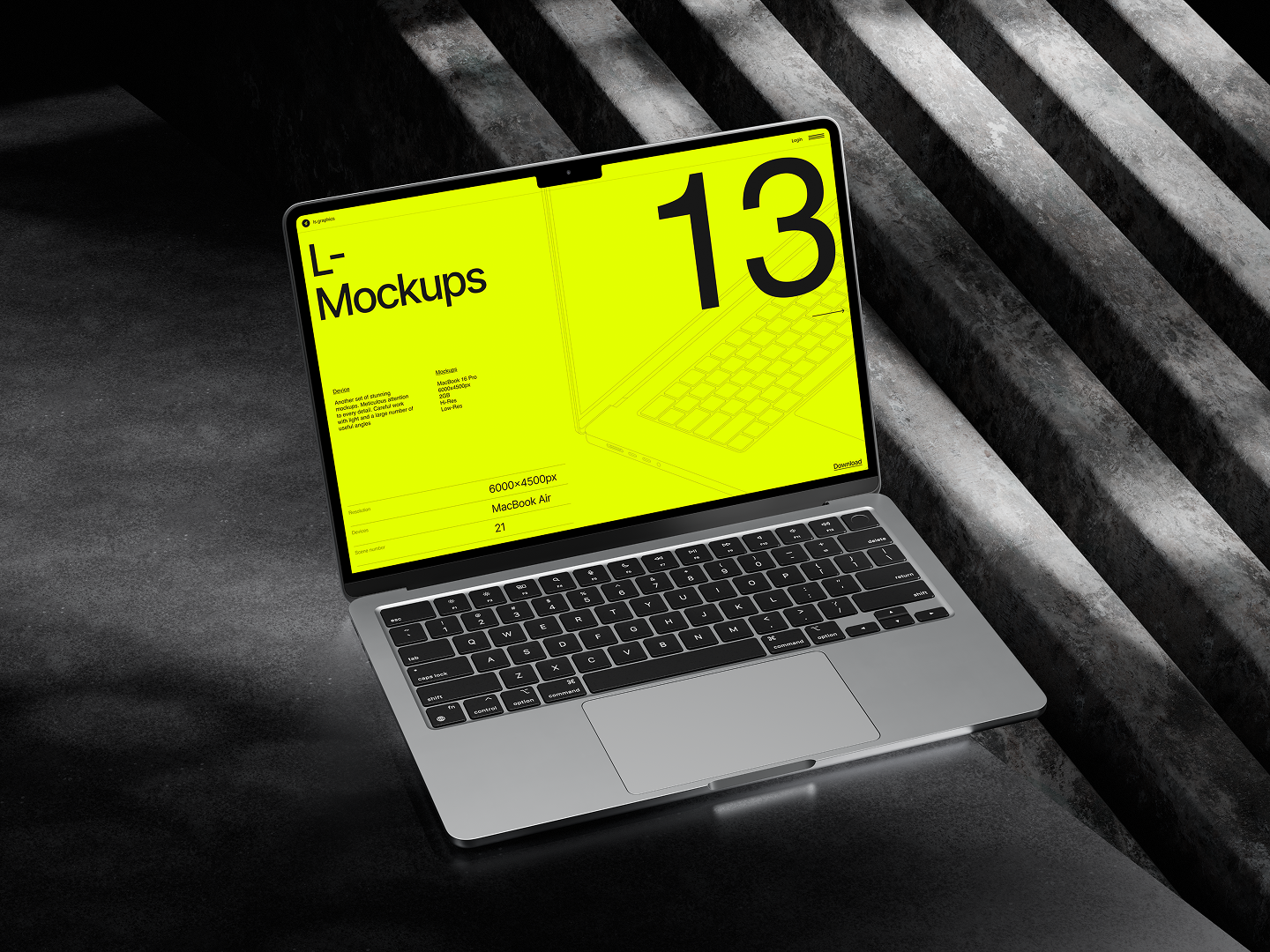
The new website presents in a more professional and structured way.
- Improved clarity and communication
- Stronger brand perception
- Better user experience